Select and customize the fundraising method best suited for your organization
BetterWorld seamlessly integrates with both online and in-person auctions
Impress donors with creative raffle items and elegant online raffles
Create attractive donation pages that maximize donor impact and boost online giving
Want to build an effective fundraising campaign?
Our team is here to give you more details and guides on how to grow your fundraiser.
Book a demo →
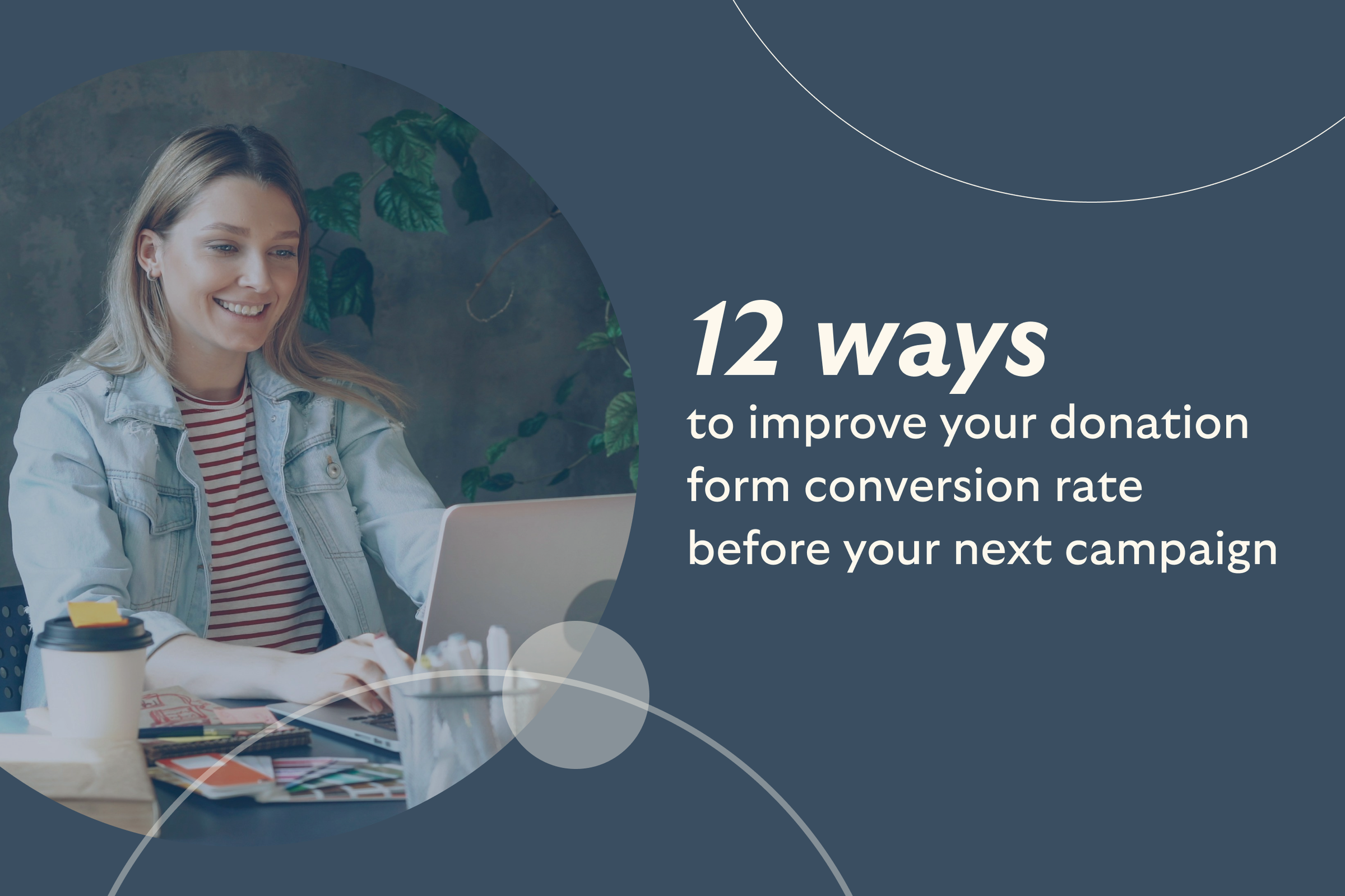
12 ways to improve your donation form conversion rate before your next campaigns
By Team BetterWorld on
Most nonprofits lose out on donations before a gift is even made. The average donation form converts just 17% of visitors, which means more than 8 out of 10 potential donors leave without completing their gift.
That’s not because they didn’t care. In most cases, the form was too long, too clunky, or too confusing. The good news? Small changes can make a big difference.
In this guide, you’ll find 12 practical tweaks that nonprofits have used to boost conversion rates by 20% to 50%. From layout and wording to payment options and recurring prompts, these tips are quick to apply and ready to help you raise more.
1. Keep it short
Donation forms that ask too much lose donors fast. Multi-step forms can cut completions in half, while simpler forms with fewer required fields see a 39% boost in conversions.
Stick to essentials: name, contact info, donation amount, and payment method. Skip the extras unless necessary.
2. Show the impact of every gift
Whenever possible, tie each suggested donation amount to a concrete outcome (“$100 = X meals served”). People donate more when they can visualize the impact.
Include one strong hero image (ideally of the people or community you serve) alongside your copy. Visuals of people grab attention: photos of people score 82% memorability, compared with 61% for generic nature images.
3. Offer preset and custom amounts
Preset donation buttons help guide decisions. Including low, mid, and high amounts, anchored around your average gift, makes giving easier.
Most donors choose the middle option. Always include an “Other” field. Nonprofits that added it saw a boost in total dollars raised.
4. Provide multiple payment options
Give donors the choice of how to pay. Credit/debit cards are essential (63% of donors prefer them), but adding digital payment options can increase gift volume.
For example, one nonprofit found that 20% of donors used PayPal once it was offered. Go further by supporting Apple Pay, Google Pay, Venmo, or ACH transfers.
5. Prompt for monthly giving
Even a small checkbox “Make this monthly” can unlock long-term support. Monthly donors give about $288 per year, compared to just $115 from one-time donors.
They also stick around longer than one-time givers. Use friendly language to explain the value of recurring gifts.
6. Design for mobile first
Roughly 57% of nonprofit site traffic comes from mobile, yet mobile forms often convert worse, only 8% vs 20% on desktop.
Ensure your form loads quickly and works well on small screens. Use large buttons, clear fonts, and a single-column layout to prevent donor frustration.
Try BetterWorld’s robust suite of charity & nonprofit fundraising tools for FREE!
7. Speed up page loading
Donors won’t wait. When page load time increases from 1 to 3 seconds, bounce rate jumps by 32%.
Compress images, remove heavy scripts, and enable caching. A fast-loading page keeps donors engaged; a delay of even 2-3 seconds can cost up to a third of your would-be gifts
8. Reinforce trust with branding and security
Make sure donors feel safe. Use your logo, match your website’s colors, and display trust cues such as a padlock icon or “Secure Checkout” near the payment fields.
One A/B test showed a 20% lift in conversion rate with just those small additions. Avoid third-party branding that could confuse visitors.
9. Show progress toward a goal
Progress bars work. When donors see you’re close to a target, they’re more likely to act. Pages with visual goal indicators convert up to 18% better, and in some studies, completion rates jumped 40%.
Use language like “Almost there, help us finish strong” to increase urgency.
10. Optimize the submit button
The submit button is your primary call to action. Use bold contrast, clear text like “Donate Now,” and keep it above the fold.
Avoid generic words like “Submit.” Warmer, mission-focused phrasing lifts conversions. Make sure it’s easy to tap on mobile devices as well.
11. Remove all distractions
Once donors land on your giving page, keep them focused. Remove pop-ups, auto-play videos, unrelated links, and main navigation.
Donors are more likely to complete a gift when the form stands alone. Keep things clean and clear, no flashy content or competing CTAs.
12. Test and improve continuously
Don’t guess, test. Run A/B tests on different headlines, images, button text, or amount options to see what drives more gifts.
But test one change at a time to learn what actually made the difference. Over time, these minor optimizations become significant gains in conversions.
Stop losing donations—BetterWorld forms are built to convert
Put all these best practices into action with BetterWorld’s modern giving tools. BetterWorld offers fully branded, mobile-optimized donation forms you can embed or display as pop-ups on any page.
Features include multiple preset amounts, a prominent recurring-donation checkbox, an interactive thermometer, and one-click payment options (cards, bank/ACH, digital wallets, etc.), all under your own logo and colors.
Every form is fast-loading and secure (with trust badges and SSL), and it even lets donors cover processing fees with a simple click.
Ready to turn more visitors into donors without spending a penny? Sign up for BetterWorld today!

Join 105,000+ amazing nonprofits, organizations, and fundraisers on BetterWorld

Let our FREE fundraising tools help you raise more funds with less effort